Brand Guidelines
Visual identity and design standards for Loopback Studio
Logo
Primary Logo - Light Background
Primary Logo - Dark Background
Icon Mark - Light Background
Icon Mark - Dark Background
Logo Usage Guidelines
- Maintain clear space around the logo equal to the height of the icon
- Do not alter colors, proportions, or orientation
- Use icon mark for small sizes (under 100px width)
- The loop represents continuous creative feedback
Color Palette
Primary Colors
Warm White
#F8F7F6
Background
Charcoal
#2E2D2B
Text / Dark Mode
Soft Gray
#E8E6E3
Muted Elements
Warm Taupe
#A09280
Accent
Secondary Colors
Wood Tone
#6B5B4D
Furniture Reference
Pure White
#FDFCFB
Cards / Highlights
Muted Foreground
#7A7066
Secondary Text
Color Philosophy
- Warm neutrals inspired by wood, stone, and natural materials
- No bright colors - restraint and calm over excitement
- High contrast for legibility without harshness
- Colors should feel permanent and timeless
Typography
Inter
Primary Typeface - All Text
Instruments that close the loop
Inter Light - 48px / Headings
Modern musical instruments for focused creation
Inter Regular - 24px / Subheadings
Body text should be set at 16px with generous line height (1.6-1.7) for comfortable reading. Inter provides excellent legibility at all sizes.
Inter Regular - 16px / Body Text
AERA / THE INSTRUMENT / EXPLORE
Inter Medium - 14px / Labels & Navigation
Type Scale
Display
60px / Light / 1.1
H1
48px / Light / 1.2
H2
30px / Light / 1.3
H3
20px / Regular / 1.4
Body
16px / Regular / 1.6
Typography Guidelines
- Use Light weight (300) for large headings to create elegance
- Generous line-height (1.6-1.7) for body text
- Wide letter-spacing on small uppercase labels
- Editorial hierarchy - feels like a book or gallery, not a website
Spacing & Layout
Spacing System
4px / 8px
Tight spacing
16px / 24px
Component spacing
32px / 48px
Section spacing
64px / 96px
Large breaks
Layout Principles
- Generous whitespace - never feel cramped
- Asymmetric layouts preferred
- Max content width: 1400px
- Vertical rhythm in multiples of 8px
- Images should breathe with space
- No tight grids - room to focus
Photography & Imagery

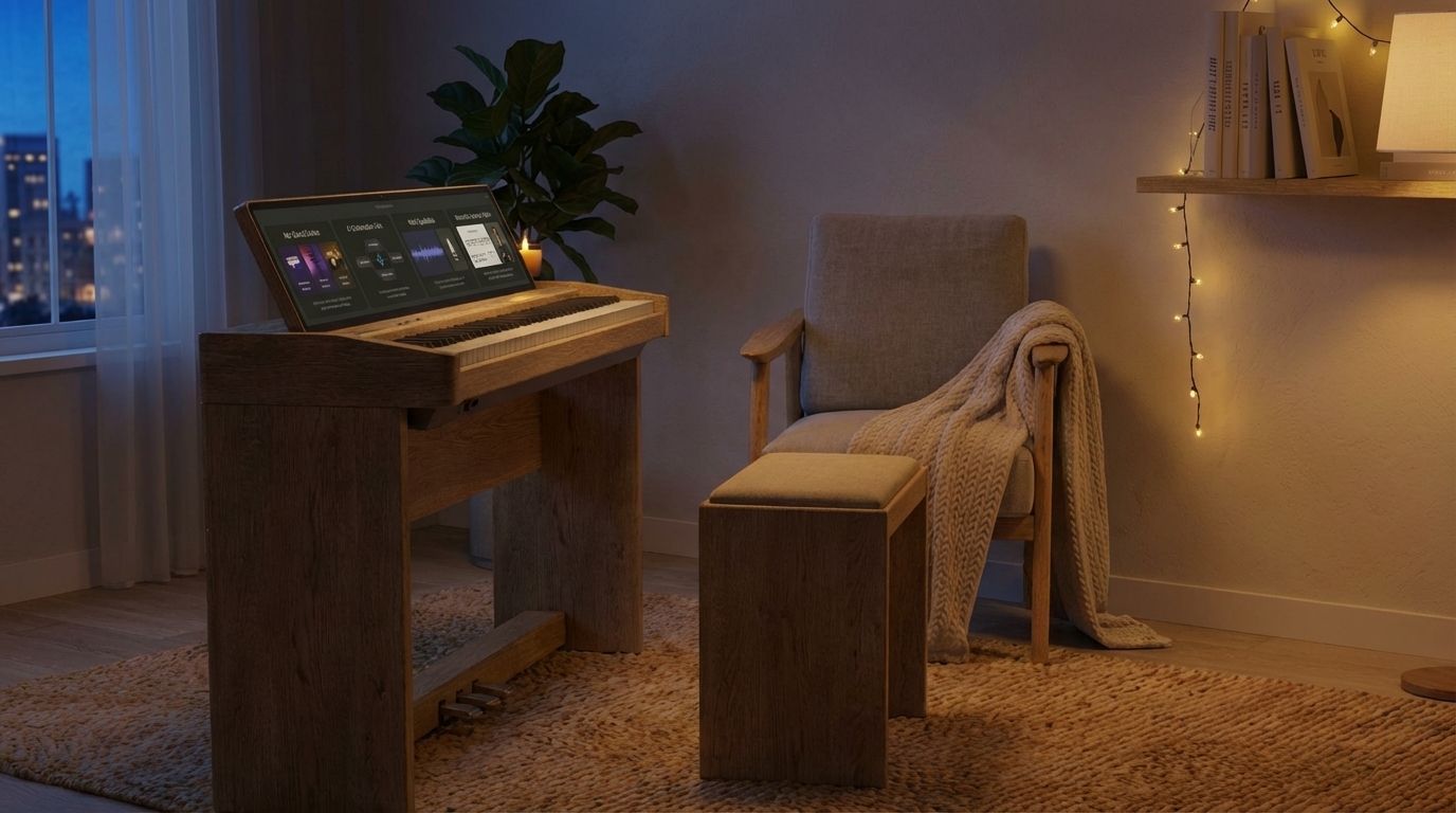
Photography Guidelines
- Warm, natural lighting - avoid harsh studio lighting
- Real spaces - homes, studios, lived-in environments
- Show instruments in context, not isolated
- Focus on craft, materials, tactile quality
- Avoid tech-focused, LED-heavy aesthetics
- Furniture-grade presentation over consumer electronics
Voice & Tone
We Are
- Calm and confident
- Instrument-first, not tech-first
- Thoughtful and intentional
- Focused on long-term relationships
- Restrained and minimal
We Sound Like
- A furniture maker, not a startup
- An instrument publisher, not a retailer
- A gallery curator, not a marketer
We Are Not
- Hyped or excited
- Tech-jargon heavy
- Feature-focused over experience
- Consumer electronics language
- SaaS or startup tone
"Instruments that close the loop" - not "Revolutionary AI-powered music creation platform"
Design Principles
Restraint
No gradients, no bright colors, no unnecessary decoration. Confidence through simplicity.
Permanence
Design should feel timeless. Avoid trends. Focus on materials and craft that age well.
Breathing Room
Generous spacing. Slow vertical rhythm. Give elements space to exist without competing.
Instruments First
Present products like fine furniture, not consumer electronics. Show craft and materiality.
Editorial Layout
Typography and hierarchy like a book or gallery. Asymmetric layouts preferred.
Subtle Motion
Slow, intentional animations with easing. Motion enhances, never distracts.